


Visualizing The Worlds’ Dependency on Russian Oil
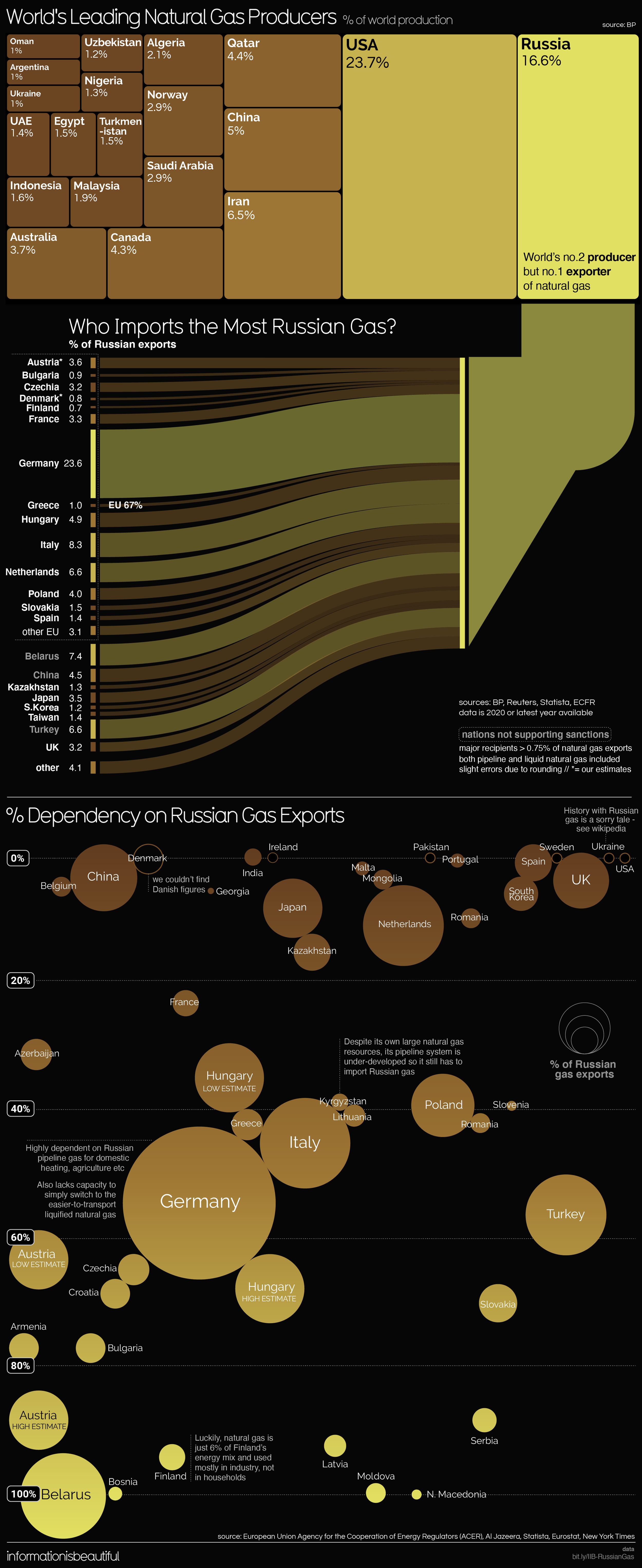
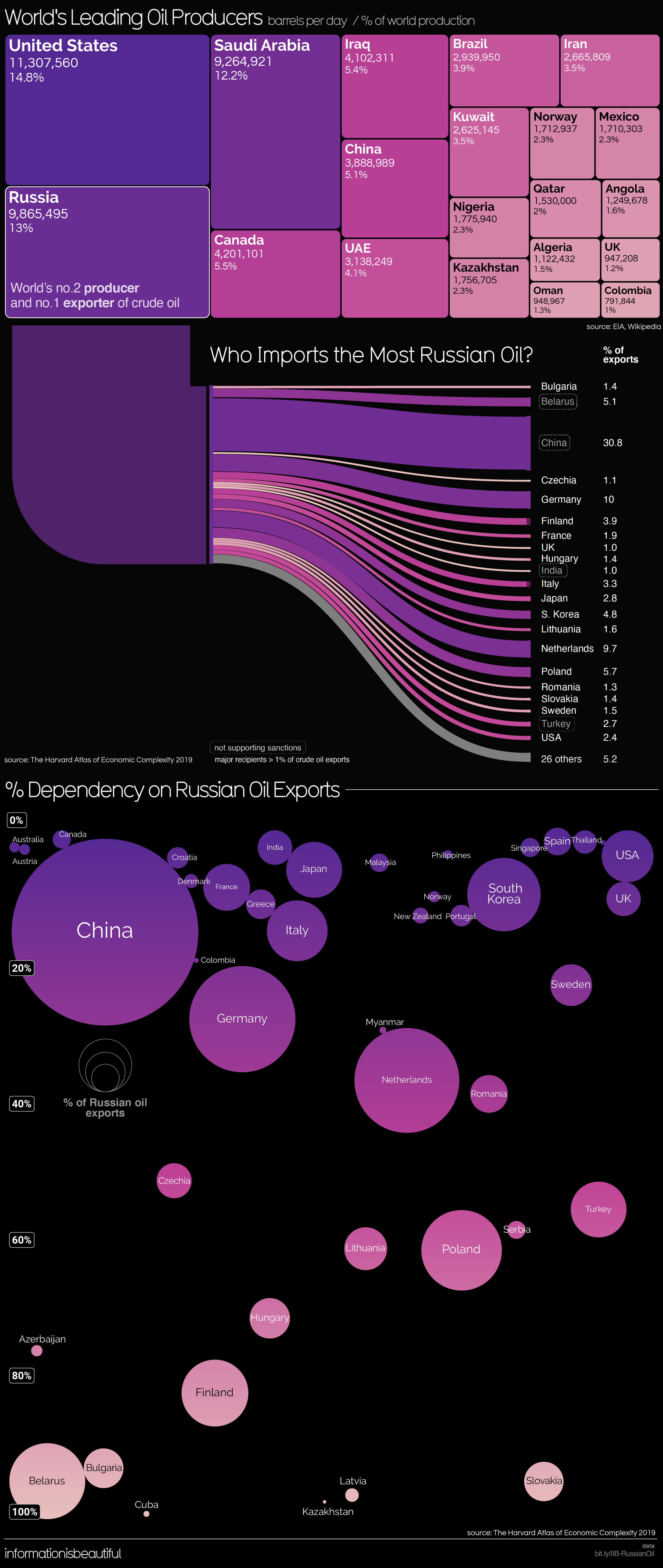
It may not come as a surprise that Russia is one of the World’s top Oil and Natural Gas Producers. But who imports the most from them? Visualizing the World’s Dependency on Russian Oil and Natural Gas infographics from Information is Beautiful shows who the Russian war with Ukraine could be effecting.
Two good infographics that use a variety of data visualization styles. Treemaps, sankey diagrams, and bubble charts. I like how the sankey diagrams are directly connected to the Russia rectangle in the treemap.


