Why Most Charts Suck - Podcast Interview

Last week I was interviewed by Lea Pica on The Present Beyond Measure podcast! Lea’s podcast covers the intersection of data visualizations and presentations, and we had such a fun conversation!
Listen to the entire interview in your browser or in the podcast player of your choice: Apple Podcasts, Spotify, Stitcher, or Google Podcasts.
From Lea’s description:
Randy dishes about the tyranny of the default, the differences between data visualizations for discovery and communication, and why we shouldn’t always use colors on everything! Randy also talks about building on templates, the problems with numbers, and the scale of visual perception.
To finish off, we get some insight into Randy’s three keys of good data viz; making your charts understandable, memorable, and actionable!
And in this episode, Randy shares all his wisdom regarding making better charts and how to pick the right kind of chart for what you are trying to accomplish!
In This Episode, You’ll Learn…
The real job of a data visualization designer.
Why most charts suck!
The value and power of data story arcs.
Randy’s three keys to good data viz!
The difference between Data Visualizations and Infographics.
About the free resources that are available on the Cool Infographics site.
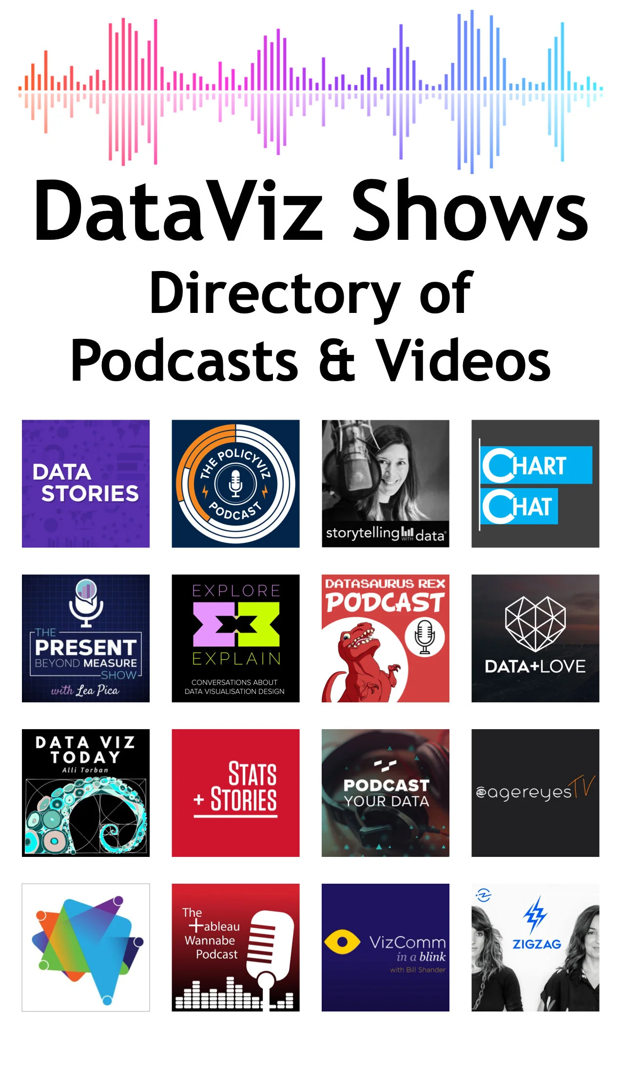
The Present Beyond Measure podcast is one of over 15 data visualization related podcasts in my directory of DataViz Shows. Check them all out!