Apple Launches Swift Charts
At the Apple World Wide Developer Conference (WWDC) in June 2022 Apple announced the release of Swift Charts, a programming framework for displaying charts in mobile applications using the Swift language. This framework is what Apple uses in their own apps like Health, Weather, Stocks and more.
This crosses two worlds for me, because there really is a User Experience Design component to chart design, and user experience designers are frequent attendees at my talk about data visualization.
Not a tool for the average data visualizer, this is specifically geared towards programmers building mobile apps. During WWDC they also released a handful of videos focused on Swift Charts and best practices for chart design in mobile apps. One of the videos features Nicholas Felton, a celebrity in the data visualization community, famous for his personal design of the Feltron Reports using his own quantified self data from 2005-2014. I see your printed copies of the Feltron Report on the desk in the video Nicholas! Very subtle!
I think this is the correct viewing order for the four videos:

Hello Swift Charts
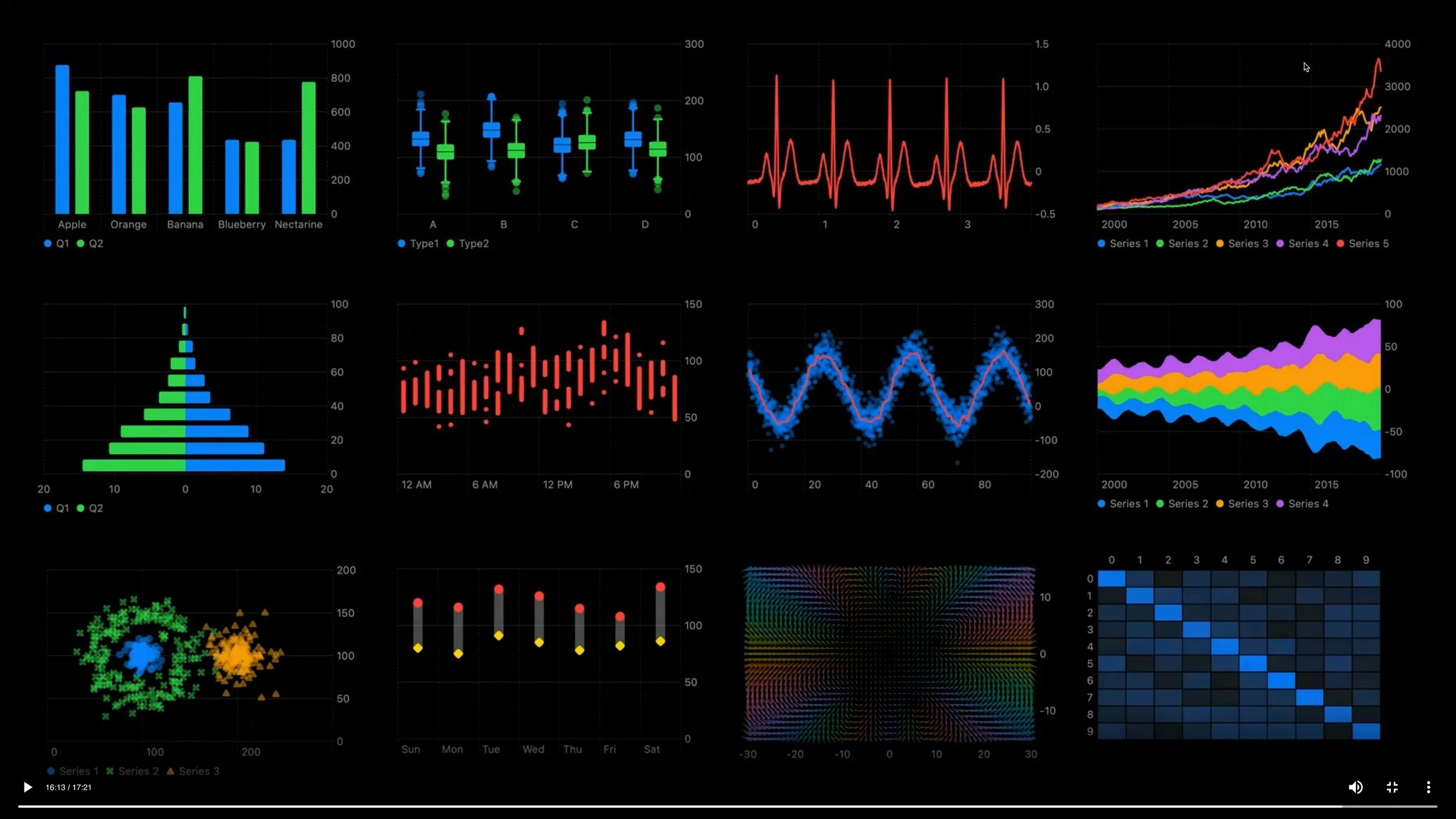
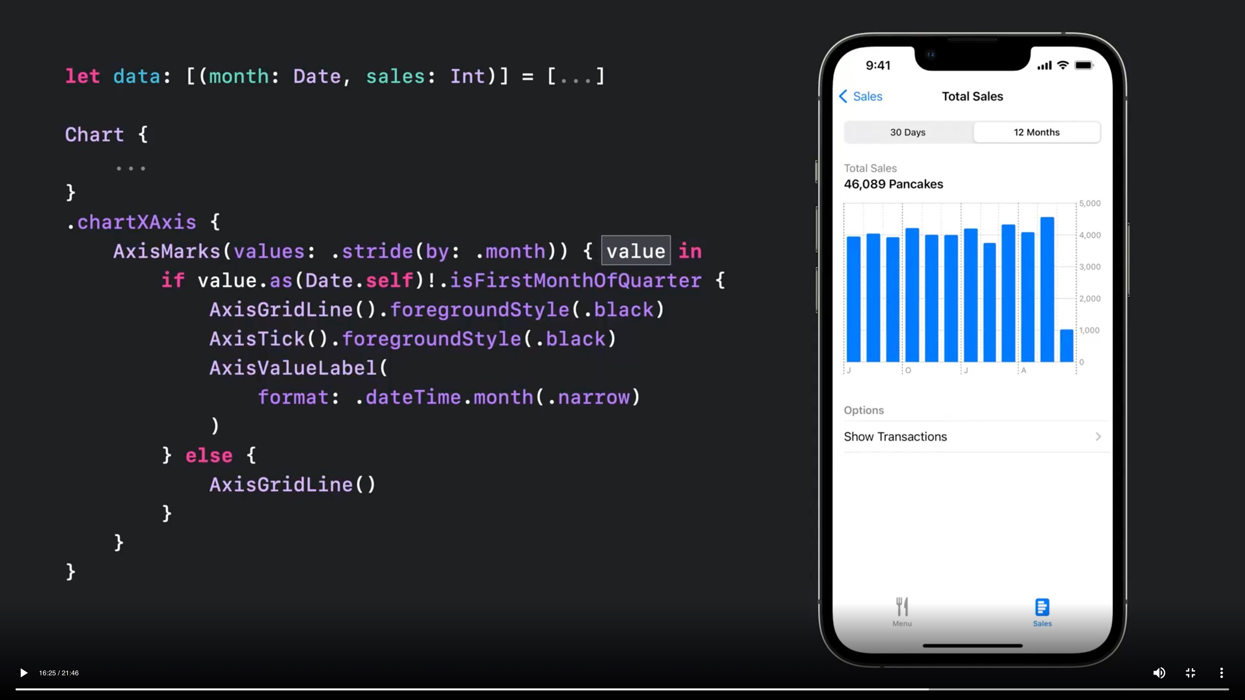
Say hello to Swift Charts — a flexible framework that helps you create charts entirely in SwiftUI that look and feel right at home on all Apple platforms. Discover how you can use compositional syntax to make informative, delightful, and accessible charts with less code. We'll share the building blocks for making visualizations with Swift Charts, and explore how you can change your charts' design with a simple modifier. We'll also take you through the latest updates to Xcode Previews to help you chart a path toward an engaging experience.

Design an effective chart
Learn how to design focused, approachable, and accessible charts. We'll show you how to design great charts with clear marks, axes, descriptions, interaction, and color and help you create useful experiences for everyone.

Design app experiences with charts
Learn how you can enhance your app with charts to communicate data with more clarity and appeal. We'll show you when to use charts, how to use them and how they work together in a chart design system.
NOTE: Look for the Feltron Report copies on the desk next to Nicholas!
Swift Charts: Raise the bar
Dive deep into data visualizations: Learn how Swift Charts and SwiftUI can help your apps represent complex datasets through a wide variety of chart options. We'll show you how to plot different kinds of data and compose marks to create more elaborate charts. We'll also take you through Swift Charts' extensive chart customization API to help you match the style of your charts to your app.