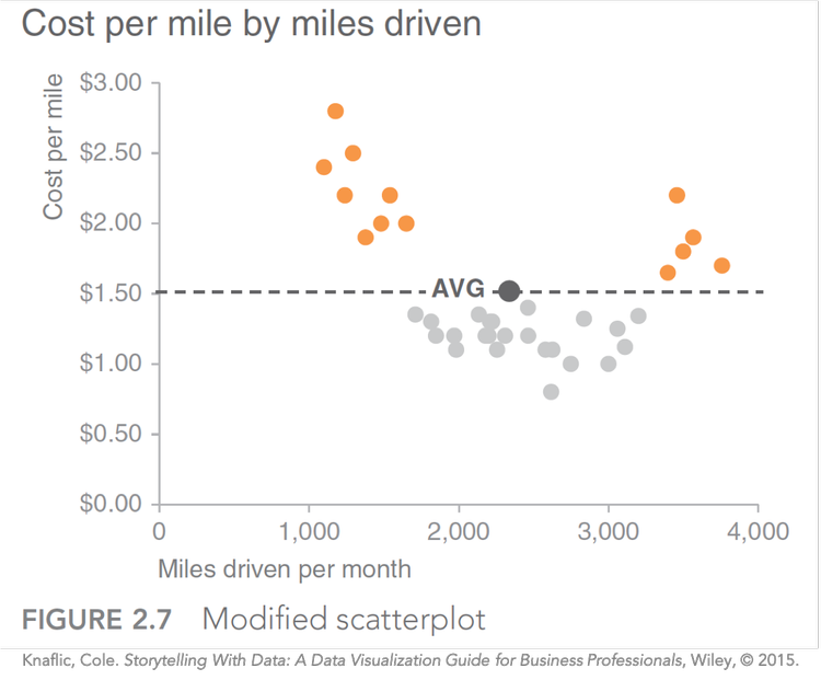
how to do it in Excel: emphasizing a data point
When we craft visualizations for explanatory purposes—that is, when there’s a specific finding or recommendation that we want to communicate to someone specific—our goal is to drive action. In those cases, our visuals should emphasize what’s interesting in the data and what requires attention.
Read more: How to format Excel so that a data series is highlighted differently — storytelling with data


