Home
Infographics
Book
Tools
Tools Directory
DataViz Guides
DataViz Shows
Word Clouds
Sankey Diagrams
Online Infographics Design
Online DataViz
Analytics Platforms
Infographic Resumes
Vector Graphics
Icon Libraries
Color Pickers
Presentation Design
JavaScript Charts
Free Stock Images
Jobs
Posters
Links
Appearances
About
Contact

Follow Cool Infographics

Need Infographics?

InfoNewt Services Social.jpg
Randy KrumDesigner | Author | Instructor | Speaker

Randy Krum

Designer | Author | Instructor | Speaker


Cool-Infographics-Book-Cover-White.jpg

FREE Sample Chapter

Read More
Cool Infographics
Creating Interactive Geospatial Visualization
Feb 8

Feb 8 Creating Interactive Geospatial Visualization

Randy Krum

From extracting geometry data to creating interactive charts — a step by step guide.

Iron Viz 2022 Global Qualifier: Visualizing the Arts
Feb 7

Feb 7 Iron Viz 2022 Global Qualifier: Visualizing the Arts

Randy Krum

For the global qualifier contest, we want you to viz about your favorite art form. Your data sets can be anything art-related—from traditional art like drawing and painting to photography, film, music, and dance. Show us what you are passionate about.

Favourite maps of 2021
Feb 4

Feb 4 Favourite maps of 2021

Randy Krum

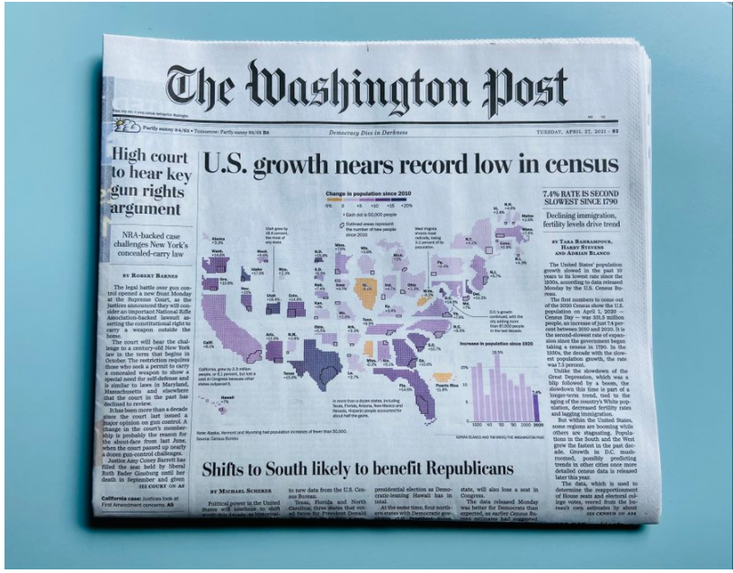
Kenneth Field collects his Favorite Maps of 2021.

Global ripple effect from underwater volcano
Feb 3

Feb 3 Global ripple effect from underwater volcano

Randy Krum

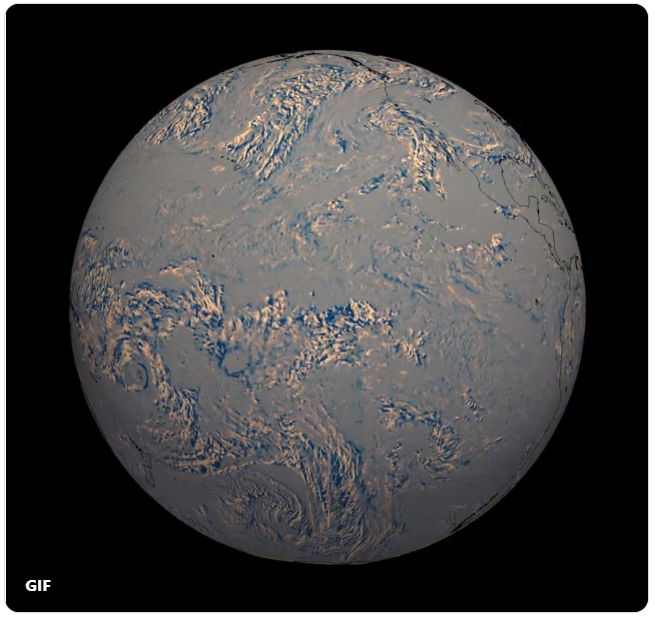
Visualizing infrared data from an underwater volcano.

Showing now versus then? Consider using a comet chart
Feb 2

Feb 2 Showing now versus then? Consider using a comet chart

Randy Krum

Showing how a measure for one period compares with a previous period is a common need in data visualization.

How to Create an Executive Summary Slide
Feb 1

Feb 1 How to Create an Executive Summary Slide

Randy Krum

A comprehensive guide to learn best practices, see plenty of examples and explore different layouts on making executive summary slides.

Pie Chart VS Bar Chart Meme
Jan 24

Jan 24 Pie Chart VS Bar Chart Meme

Randy Krum

Fun meme about about the difference between pie charts and bar charts.

Media Bias Chart- 2022
Jan 18

Jan 18 Media Bias Chart- 2022

Randy Krum

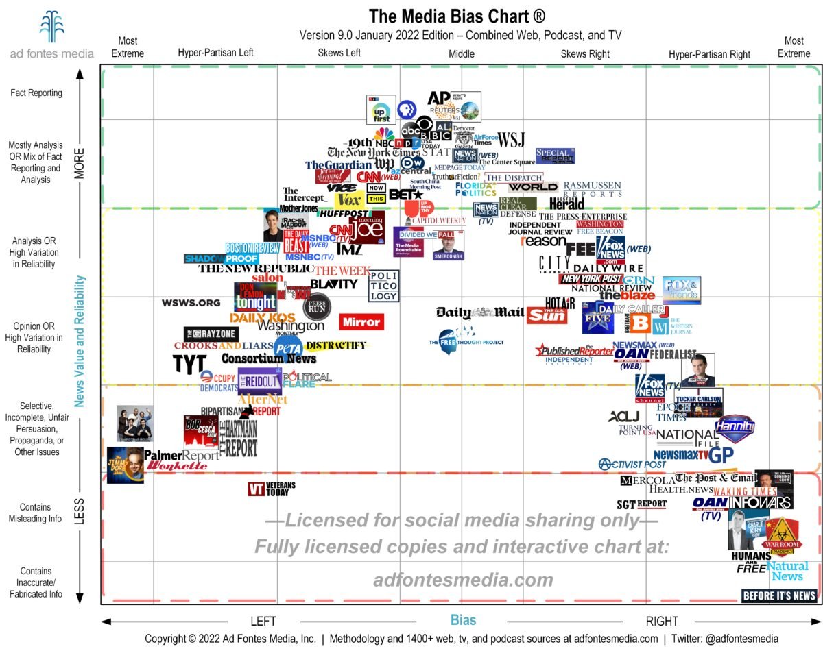
New year, new Media Bias chart!

Bad Ideas In Visualization
Jan 17

Jan 17 Bad Ideas In Visualization

Randy Krum

Michael Correll gets on his soapbox to criticize what he sees as bad ideas in visualization.

Signs Your Data Viz Sucks
Jan 14

Jan 14 Signs Your Data Viz Sucks

Randy Krum

What makes a data viz suck or sing isn't just about its outward appearance. That's only going to get you so far and it isn't even the most important part.

Formatting Long Labels in Excel
Jan 13

Jan 13 Formatting Long Labels in Excel

Randy Krum

Learn how to wrap your Excel graph labels on two lines AND align them to the left or right using this little trick.

Motion Graphics: A Complete Guide for Marketers & Brand Leaders
Jan 12

Jan 12 Motion Graphics: A Complete Guide for Marketers & Brand Leaders

Randy Krum

Looking to design a motion graphic or video for your next marketing or internal communication campaign? Here's everything you need to know.

Covic Visualizer
Jan 11

Jan 11 Covic Visualizer

Randy Krum

A catalog of Covid-related graphics across countries, sources, and styles.

What Gordon Ramsay Taught Me About Data Visualization
Jan 10

Jan 10 What Gordon Ramsay Taught Me About Data Visualization

Randy Krum

Lessons from the culinary world.

An Illustrated Guide to Data Literacy: Base Rate Fallacy
Jan 7

Jan 7 An Illustrated Guide to Data Literacy: Base Rate Fallacy

Randy Krum

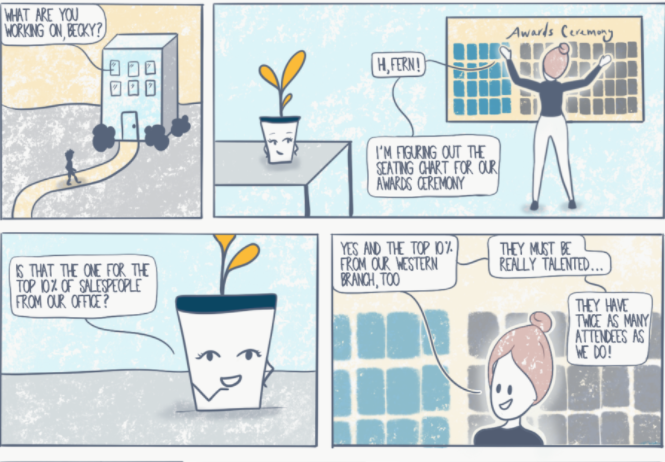
Data Literacy’s new comic on Data Fallacy.

Our 51 Best (And Weirdest) Charts of 2021
Jan 6

Jan 6 Our 51 Best (And Weirdest) Charts of 2021

Randy Krum

You can click any of them to read the stories in which they originally ran.

The Year in Charts
Jan 5

Jan 5 The Year in Charts

Randy Krum

2021 expressed through charts

Announcing the Winners of the 2021 Data Literacy Awards
Dec 31

Dec 31 Announcing the Winners of the 2021 Data Literacy Awards

Randy Krum

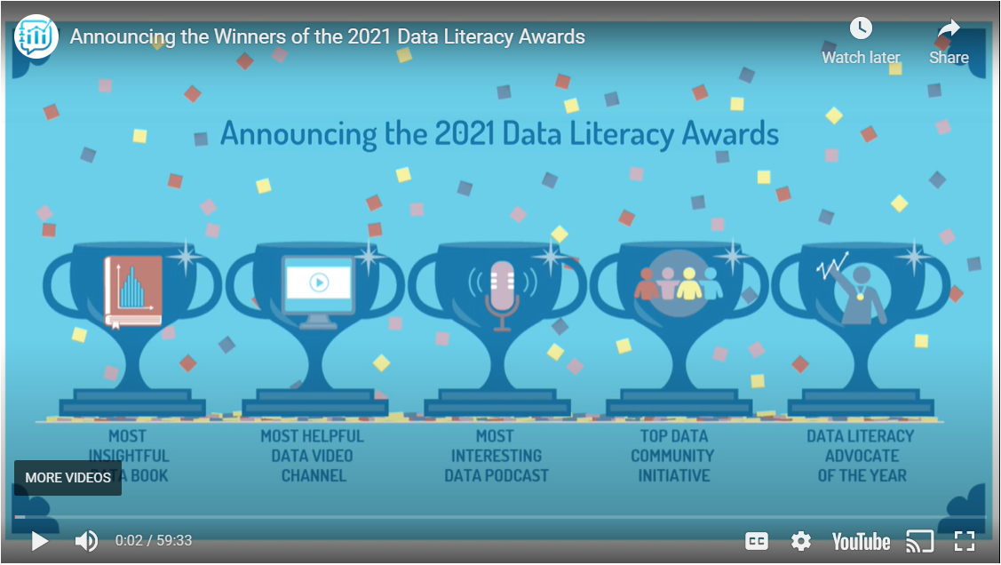
2021 Data Literacy winners have been announced.

A Data Storytelling Project with Some Advanced Visualization in ggplot2
Dec 30

Dec 30 A Data Storytelling Project with Some Advanced Visualization in ggplot2

Randy Krum

Some Practical Data Preparation and Useful Plotting Techniques in ggplot2

What Makes a Good Infographic? 7 Helpful Tips
Dec 29

Dec 29 What Makes a Good Infographic? 7 Helpful Tips

Randy Krum

Find out what to include in your infographic to make it interesting, informative, and appealing to your target audience.

Load More

Subscribe to the Cool Infographics Email List

Sign up for weekly emails related to Cool Infographics and data visualization news, events, articles, updates, giveaways, discounts and discussions! I only send out a few emails per month, and try to make sure they include lots of valuable information.

We respect your privacy.

Thank you! We send out emails roughly once a week, so you should receive your first email soon!


Submit an infographic or news article for review and consideration through the CONTACT page!


Randy Krum
Randy Krum
Download a FREE Chapter!
Subscribe on the Flipboard app
DFW DataViz Meetup Group
Data Visualization Charts in PowerPoint course on Skillshare
 

Follow Us

Copyright (C) 2023, Randy Krum, InfoNewt LLC

Book
Links
Tools
Jobs
About
Contact