The U.S. Baby Bust
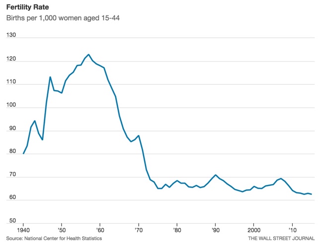
The U.S. Baby Bust is shown in 5 line charts by the Wall Street Journal. Sometimes a clean & simple line chart is the best way to show your data.
The general fertility rate fell in 2015 to tie the lowest level on record. Fertility, defined as the number of live births per 1,000 women ages 15-44, has never been lower than the rate recorded last year and in 2013.
It’s no surprise that Americans are having fewer babies than in the years after World War II, when there was an incredible baby boom. And it’s of course well known that people generally have smaller families today than in the past. Add the severe economic recession that began in 2007 to the picture, and you have the elements to push the birth rate to record lows.
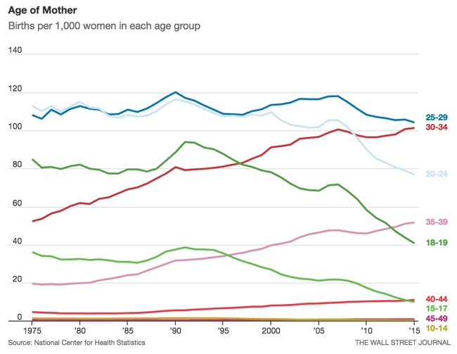
In this second chart showing the various age groups, the rainbow of colors is a little distracting. One way to tell a specific story with this chart would be to only color the lines that have increased over time, and make the rest shades of gray. That would tell the story that the women in their 30's are the dominant growth age groups.
A separate chart highlighting the lines for teens and 20's would better tell the story of women putting off having children until they are older.
Go check out the WSJ article for the other observations they made from the data.


