The Chart Guide v4.0 - Interview & Giveaway

Michiel Dullaert, data visualization expert and trainer from the Netherlands, has updated his Chart Guide poster to version 4! A free PDF is available for download from his website, and introduces a new category, 19 new charts and 4 extra design tips. You can also purchase a full-size printed poster version.
As the November 2019 Giveaway, I have a pair of Chart Guide posters, that will be shipped to one lucky winner. That way you get one for yourself, and one you can give to a friend or coworker.
Register HERE by November 30, 2019 at 11:59pm CT, and the winner will be randomly chosen on December 1st!
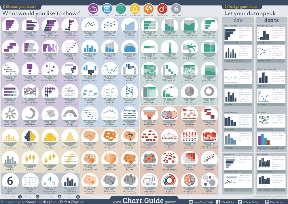
This poster shows 84 charts to choose from and includes 16 chart design tips to help you make the Perfect Chart. The poster is available as a big poster or you can download the PDF file for free. Let this ChartGuide poster help you choose and design your Perfect Chart.
You can see his complete write-up about the new version HERE. I was able to ask Michiel a few interview questions about developing the posters:
Cool Infographics: What’s your background and how did you get into visualizing data?
Michiel Dullaert: Years ago I have been working in the boardgame and puzzle industry. Part of my work was discovering new boardgames and puzzles and introduce them to the market. I was working for two different companies, both at the time that a new product of theirs really changed the market. For the boardgame industry I worked for the company that introduced a new type of boardgame (the game of Catan) that made playing boardgames a popular hobby. After that, I worked for a company that created puzzle magazines at the time the Sudoku puzzles was introduced. And here the same happened again, a new type of puzzle that changed the way people would puzzle and talk about puzzles. Both were very nice jobs, with a lot of enthusiastic conversations with customers about new products.
In both companies I was working in the product development. I always had a large personal interest in the data behind the products. So it felt logic to do more with data, and I changed careers. I started working for a large company as an analyst. And it was not long that I found out that my colleagues were not interested in my reports. Although the reports contained interesting information it was shown in large tables and busy charts. People seemed to be not interested and if the looked into the numbers, they did not seem to understand them. My work did not seem to matter. The contrast between my previous jobs and the work as an analyst could not have been bigger. At that time I decided I would try to find a way to make people as enthusiastic about data as they were about boardgames and Sudoku puzzles.
The first step was reading books on the topic of data visualization. Because I was working in the business intelligence field, the most logic choice were the books of Stephen Few. I bought them all and a whole new world opened for me. When Few was in the Netherlands to give a course I felt very lucky I could join. The workshops inspired me to learn more on this topic. So I bought more books and the next year I joined a class of Alberto Caïro. This gave me multiple perspectives on the same topic. The things I learned were applied to my work, and I was getting more and more responses on my visualizations. People actually started to read and understand them.
My manager asked me to explain my choices in visualizations to my colleagues, so they could learn from me. And then I discovered how great it is to teach about data visualisation. I met a couple of UX designers and they inspired me learn more about that topic and to get an UX certification. The knowledge I gained in learning UX helped me in developing my own perspective on good data visualization. And in my workshop I try to inspire others to create such. For these workshops I wanted an overview of charts. Although there were already some great overviews, none of them had the point of view I was teaching in class. So I decided to design my own. That’s how Chart.Guide started.
Cool Infographics: Who is the Chart Guide poster intended for?
Michiel Dullaert: The website and the posters are intended for everyone who makes charts. For me it does not matter if you are working as a data-journalist or a data scientist, a infographic designer, project manager or a financial analyst. As long as you need help or inspiration when making charts or tables, Chart.Guide can help you. Online in the form of the website and offline in the form of the poster. Because I want to inspire as many people as possible I made the PDF of the poster free to download. I know that the poster is used in business departments, newsrooms and in school classrooms.
Cool Infographics: What was your design process for the poster?
Michiel Dullaert: The main source for updates to the poster or website, is the conversations I have with people I teach or work with. If they have a need for certain chart types, or make design mistakes, I try to add that topic.

DPG Chart Chooser
The first poster edition (picture DPG Chart Chooser) was just a collection of charts I created for my students. For each chart a few words on when to use the chart and, more important, it gave advice on what charts were not recommended. On the second edition (the first under the Chart.Guide brand) I added chart design tips. The reason, I saw people choose a good chart but then mess up the design. Last year, I got questions about maps, so I decided to add them on poster edition 4.

Rearranging the layout of the Chart Guide
The design process starts with insight I get from conversations I am having. Next step is cutting the old poster and rearranging everything. (see picture ChartGuide rearrange) now, will lead to more insights on the poster in the future. Although it make take some time to transform everything to the screen or paper. I still need to find some time to explain on the website why some charts are “not recommended”.
Cool Infographics: You asked your followers to help choose the design of the new poster. How did that go?
Michiel Dullaert: The poster is made to help people. So it seems to be logic to give them a role in the design process. As a UX designer I like to test my designs before releasing them. Most of these tests are done in class, because I like to observe the users in how they use the new design. The online voting was suggestion of a student. It did give me a lot of useful feedback. Especially when people wrote a lot of text explaining their choice. For future editions I will do the same.
Cool Infographics: How can people follow you for updates?
Michiel Dullaert: People who have downloaded the PDF will get an email when a new poster is available, or when something interesting is added to the website. For this and more chart related inspiration, they can follow me on Twitter: @Chart_Guide or on facebook: /ChartGuide1.
This helpful reference guide is one of over 25 FREE data visualization guides I maintain links to in the Cool Infographics Tools pages. See them all on the DataViz Reference Guides page, and let me know if I’m missing any.