What Really Extends Lifespan?
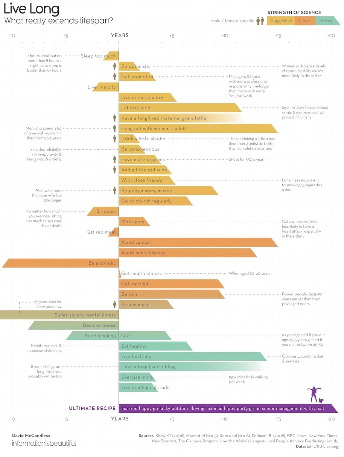
David McCandless from InformationIsBeautiful.net has released his LIve Long: What Really Extends Lifespan? infographic design that explores how much impact different behaviors can have on your life, and how strong the scientific research is to back up the claims.
What’s the best method of life extension? Diet and exercise? Or polygamy and pets? The latest data visualized.
Most of David’s designs are fully transparent with the data, and this design follows that tradition. All of the data and sources used in this design is summarized in this Google spreadsheet.
This design is a good exercise in visualizing uncertainty. The number of years for each activity is not exact, so I think the couple of bars that fade into white are more appropriate. The angled cut at the end of most of the bars seems more artistic. I like the additional aspect the strength of the science behind each claim is color-coded into the bar chart.
This infographic was originally published in the Knowledge Is Beautiful book, available on Amazon, and should be included in every data visualization designer’s library.


