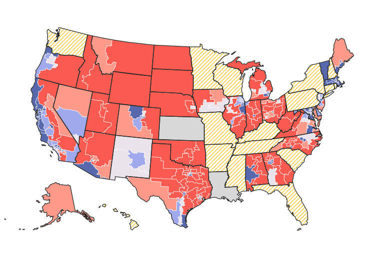
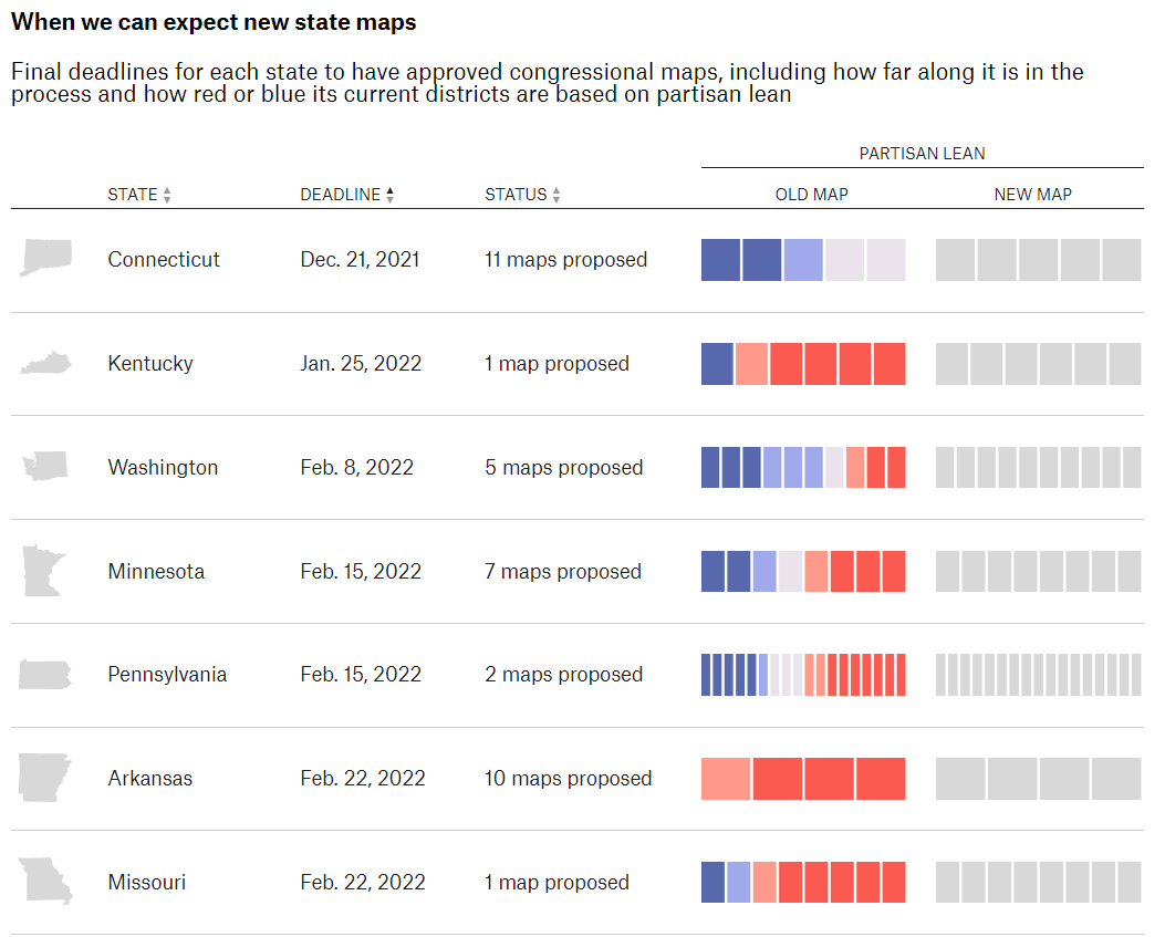
What Redistricting Looks Like in Every State

What Redistricting Looks Like in Every State is an updating tracker of proposed congressional maps. This is going to be a popular topic all year, and the interactive map by FiveThirtyEight shows how redistricting benefits Democrats or Republicans in the 2022 midterms and beyond. State and local governments are using information collected from the 2020 census report to redistrict each state. There are multiple states that have not been released yet however the graphic below shows the proposed dates for the next few updates.
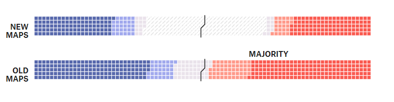
I prefer the grid visualization over the map. The map has the same problem as most election maps in that it’s visualizing the real estate area of the districts. This over-emphasizes the the rural areas with more land, but less people. I think the grid visualization does a better job of representing the count of districts that are changing or already have a clear majority.
Visit FiveThirtyEight to interact with the data and check in as the map is updated.