In this guide, we’ll aim to rectify these mishaps by sharing examples, clarifying when you should (and shouldn’t) use a stacked bar chart, and discussing best practices for stacking bars.

All tagged Charts
In this guide, we’ll aim to rectify these mishaps by sharing examples, clarifying when you should (and shouldn’t) use a stacked bar chart, and discussing best practices for stacking bars.
Packing a suitcase and preparing a presentation deck are surprisingly similar.
Here is what I propose: a weekly newsletter in which we elevate each of those kinds of data visualizations. In How To Read This Chart, we’ll consider good charts, parse complex ones and discuss how bad ones might be improved.
You can click any of them to read the stories in which they originally ran.
An interesting take on infographics design. I agree with the ideas, but not the examples they included.
Matt Baker from UsefulCharts.com has changed to using Adobe Illustrator to design his family tree posters. He published a new behind-the-scenes tutorial video.
Steve Wexler and Andy Cotgreave are asking everyone in the dataviz community to submit examples of Charts On Screens, where charts have been used as part of the plot in movies and tv shows.
Today at Flourish, they introduced a new Gantt template, which is ideal for creating beautiful project plans and schedules – or for visualizing any data describing defined periods of time.
6 Charts That Dismantle The Trope Of Asian Americans As A Model Minority from NPR.
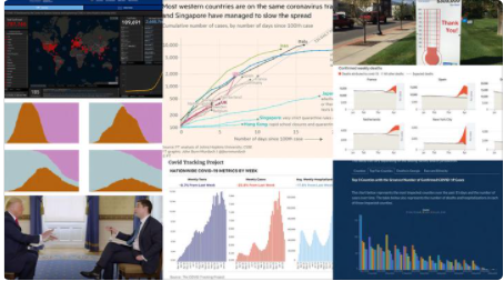
Andy Cotgreave reflects on 8 lessons we can learn from the last year of COVID data and charts.
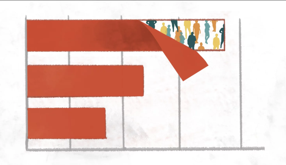
From Stephanie Evergreen: Proportion plots help us compare the share of a population between two metrics. It uses length on the left and right side of the chart and connects the lengths by a band in the middle that swoops a lot if there is disproportionality and stays pretty even if the proportions are the same.
Watch online as Jeffrey Shaffer, Steve Wexler, Amanda Makulec, and Andy Cotgreave debate the good, the bad, and the “screaming cats” of data visualization, and stay for the after party!